After every contest there is that moment when the log is closed and you find yourself looking at a long list of callsigns, timestamps and reports. 815 lines of it after the CW field day 2026 with DL0AT/P. For us operators every one of those lines holds a small story – for everyone else it is a spreadsheet, at least at first. An animation of the contacts, on the other hand, makes it clear to anyone how a contest actually unfolds.
There are plenty of tools that turn a log into a static map of all contacts. A map like that already helps a great deal. But it only ever shows the final result: a dense mesh across Europe, a few arcs over the Atlantic, one lonely marker in the Indian Ocean. What it does not show is how things developed. When did 40 m open up? When did the station switch to 80 m during the night? At what point in those 24 hours did 3B9FR suddenly appear in the log on 10 m?
That is exactly what I built a small tool for: qso-animation.
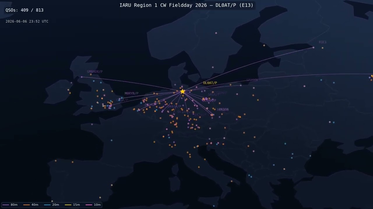
Here you can watch the animation of the CW field day 2026, for example:
The Idea
A Cabrillo log goes in at one end, an MP4 comes out at the other.
The input is exactly the file you submit after the contest anyway. The script reads the contacts, looks up their locations in various sources or falls back to the prefix. It then draws a great-circle line from your own station to each worked station for every QSO. Instead of a finished map, you get to watch it being drawn: arc by arc, hour by hour, from the first contact after the contest starts to the last QSO just before the end.
On top of that comes everything you need to find your bearings while watching: colouring by band, so band changes jump right out at you, a running clock and a QSO counter in the frame – and, if you want it, the grey line, synchronised with the contest time taken from the log.
The combination of grey line and band colours is what makes it particularly appealing: you see the terminator travel across the map and, at the same time, how the contacts change bands along with it.
The resulting video is configurable: the contest can be relived as a two-minute time-lapse – or considerably slower. The leisurely pace is interesting for an amateur radio information stand, for instance. There the animation can show visitors how a contest unfolds and just how far amateur radio contacts can reach.
The locator and the station callsign are still hard-coded at the moment. Making all the required values configurable for other stations would be a good first contribution (low-hanging fruit) – and I am happy to help out if any questions come up.
Why Write My Own Script?
There is no shortage of map generators for log files, many of them as an online service. One thing in particular mattered to me, and I did not find it anywhere:
The development over time. An animation tells the story of a contest, a map merely summarises it. And it can be reused: what I was after was being able to cut excerpts into my videos about field days and similar contests, to make the whole thing tangible for people outside the hobby.
In Practice: Field Day 2026
815 contacts over 24 hours, five bands – a single invocation turns that into a video of roughly three and a half minutes:
python3 qso_map_animation.py <callsign>.log --speed 400
Before rendering, the script tells you how long the video is going to be:
Contest duration: 23.9h, speedup: 400.0x -> video: 216.1s (3.6 min)
Give It a Try
You need Python and ffmpeg, the rest comes from the Makefile:
make venv
source venv/bin/activate
python3 qso_map_animation.py <callsign>.log
That produces qso_map.mp4 in the current directory, Full HD, with default settings.
For a quick test it pays to render a subset – the first 30 QSOs are done in seconds,
whereas a full 4K run does take a while:
python3 qso_map_animation.py <callsign>.log --start-qso 1 --num-qsos 30 -o test.mp4
And once the parameters are dialled in, the full treatment:
python3 qso_map_animation.py <callsign>.log \
  --width 3840 --height 2160 --dpi 240 --fps 30 \
  --speed 960 --camera-follow --grayline --dots-only \
  -o qso_map_full.mp4
Two of those options deserve a special mention. --camera-follow makes the camera
follow the most recent contacts, look-ahead included: a distant QSO pulls the frame in
its direction ahead of time instead of jumping there abruptly. On a map of Europe during
a contest this looks surprisingly cinematic. And --dots-only makes the lines disappear
after they have lit up, while the dots remain as permanent station markers – with
several hundred QSOs that keeps the map readable instead of ending in a ball of wool.
Every option is documented in the README.md in the repository; that is also where I
cover the resolution/DPI coupling and the speedup table for other video lengths.
Where the Locations Come From
A Cabrillo log does not contain the other station’s locator, so every callsign is looked up – in this order:
- the local cache from previous runs, including the negative results
- HamDB, free of charge and without an account
- the QRZ.com XML API, if credentials are configured – it fills the remaining gaps
- a local prefix table as a fallback, focused on Region 1 countries
Portable suffixes such as /P, /M or /QRP are stripped before the query. If any
callsigns remain that cannot be found anywhere, -v lists them – in that case the
contact simply ends up at the centre of the prefix country rather than on the other
operator’s doorstep.
A Note on How It Came About
I had had the idea for this tool in the back of my mind for quite a while, as a way to enrich my videos, but for lack of time it never got built. This year, after the IARU Region 1 field day, it came back to me and I gave it a go together with an LLM – the video above is the result.
The whole thing is an after-hours project – there is a reason “simple QSO animation script” is what the project description says. And it was created entirely in collaboration with AI. I am writing that down deliberately, because I consider it fair information and because it has an immediate consequence for this project.
For a tool of this size it works remarkably well: the task is clearly defined, you can literally look at the result, and if an arc ends up in the wrong place, that is immediately obvious in the video. What the AI does not take off your hands is deciding what the tool should be able to do in the first place – and judging whether the result makes sense from an operating point of view.
Contributing
If you have further ideas, you are warmly invited to contribute them. Issues and merge requests in the GitLab project are explicitly welcome.
And yes: using AI to contribute is explicitly allowed. I do not want to dictate what tools you develop with. I do have two conditions, though, and they apply regardless of whether an AI was involved:
- The change has been tested – run once against a real log, with a look at the result.
- Existing functionality stays intact. Whatever works today has to keep working after the merge request. Bug fixes excepted, of course ;-)
I am equally happy to hear back from real-world use: other contests, other logging software, callsigns that slip through the lookup.
And if you end up animating your own field day, your portable weekend or your whole contest season: feel free to send me the link. I am genuinely curious what people find this tool useful for.
73 and have fun going through your log, Heiko, DH3IKO
Comments
Comment on this post with your Fediverse account by replying to the corresponding toot:
– favourites – shares